How I structured website content for a platform and acquired more than 10 clients.
Overview
The Product
Platform that helps restaurant owners to create a digital menu and manage their orders online
Task
Organize website's content structure
Duration
4 weeks
My Role
UX/UI Design
Design Process
Discovery
Define
Design & Test
Delivery
Competitor Analysis
Wireframes
User Testing 1
Crazy 8's
Design
User Testing 2
Prototype


Project's Goal
The goal of this project was to enhance the structure of the website's content.
During a kickoff meeting with stakeholders, I gathered insights into their needs by asking questions about the product, including its challenges, opportunities, goals, and limitations.
Through this analysis, I identified the primary issue: the main page was not effectively communicating what the product offers.
Research
Five competitors were chosen for analysis. Here I wanted to understand the main functions of other online menus and how they organize their websites' content.


Insights
Some websites are confusing and do not communicate their solutions.
Some websites let new clients schedule a meeting to understand how the platform works.
Only one lets new clients test the platform for free for a few days.
After doing the competitor analysis, I've decided to organize the content on Take's website on a single-page structure:
What we do
Solutions we offer
Benefits for your restaurant
How we charge operations
Plans and pricing


Wireframes
According to the NN/g group article How long do users stay on web pages says that to gain several minutes of user attention, you must communicate your idea in 10 seconds. Users often leave web pages in 10-20 seconds, but pages with a clear value proposition can hold attention for much longer.
User Criteria
People who own a business that could subscribe to Take
Insights
Of the total of 4 users, only one could understand what Take is about.
The only one who understood the website page suggested text and structure changes.
Two people talked about the bad quality of the mockup. "How does this benefit my business? said one of them.
Format
Online and on-site
Participants
Four


User Testing Round 1
With some sketches done, I've worked with a developer to elaborate a prototype and then
decided to run a content test on the first page.
Goal
Understand if Take's first page content describe the product
Crazy 8's
I facilitated a Crazy 8's workshop with developers and investors to ideate a new content structure for the main page. This exercise was important for discovering how each participant structured phrases that describe the product. I've noted that everyone always has something to add that could be very helpful for the project.


User Testing Round 2
User Criteria
People who own a business that hadn't participated in the user testing round 1
Format
Online/On-site
Participants
3
Insights
All users interviewed classified as 5 their understanding of the business.
All users interviewed feel comfortable with moving forward to subscribing to Take or were interested in scheduling a meeting.


Goal
Investigate if people
understand what
Take does
Solution
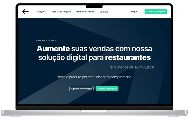
The new solution offers a text structure in this order:
Greeting: Welcome to Take.
What we do and how: Increase your sales with our digital solution for restaurants.
Makes us unique: Subscribe and sell in less than 10 minutes.
See for yourself: Test the product for 30 days without commitment.


What did I learn from this project?
The kickoff meeting - was important to ask the stakeholders about their culture, opportunities, and goals.
Collaboration - working with three different roles in the same project allows you to prepare for meetings, present your ideas, and improve them constantly with the team. And also, talking about product limitations that you should be aware of.
Competitor analysis—This practice can quickly help you understand your players' strengths and weaknesses, resolve usability problems, and understand where the product is.
Testing products with real users at the first moment seems difficult, but by doing a schedule, defining goals, and planning all your tests, everything works fine. Mighty insights come from users' phrases and are powerful if we can pay attention all the time, and
Test as many times as you need.
